

Grading the MLB’s city connect uniforms
The MLB has finally revealed all the City Connect uniforms for the 2024 season, which means it’s time for myself, local jersey designer JakeH28 to review all the city connect jerseys we know about for this year. This is an entirely subjective grading, based on my opinion of the looks and the city connections, so if you disagree with the opinions in the article, I encourage you to leave us a comment! Let’s get started.
Arizona Diamondbacks: B-

The Diamondbacks City Connect is a fairly bland and simple look that isn’t super exciting or special. The tan color is neat and the script “Serpientes” is a nice and unique element to the uniform while also being a nod to the Hispanic community. The jersey can be paired with both white and tan pants, which gives some variety to the look. However, the design as a whole leaves much to be desired. The sandy look is just boring and empty, and really could have used some stripes and color to spice it up.
Atlanta Braves: A

Sometimes, you don’t need to go for unique and crazy designs that supposedly tie in your city with the team on your city connect. In the case of the Braves, they really kept things simple and honored Hank Aaron with 1970’s throwbacks- sort of. The overall design of the uniform is from the 1970’s, but the script from the original jersey was replaced with the braves alternate logo saying “The A,” which is the lone city reference on the uniform. Out of the city connect messes Nike unveiled for the rest of the MLB, Atlanta got one of the best looking jerseys.
Baltimore Orioles: D-

Making an all-black uniform in sports is a very hard thing to pull off, and while it can be done, this was a very poorly executed design. All the city connections are hidden away on the uniform, creating a very bland aesthetic. The only things preventing this from failing are the fun colors, and the decently unique cap logo, one of the better MLB one-off logos. The uniform isn’t as bad with white pants either.
Boston Red Sox: C+
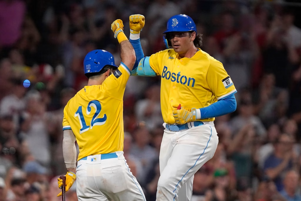
It’s weird to see the Red Sox wear a jersey without any red, and it certainly is weird to see them don a bright yellow jersey with strange fonts and bright colors throughout. While it honors the Boston marathon, this is certainly not a good looking uniform. It’s always jarring to see the Sox put on these fairly ugly jerseys, and it certainly was an interesting way to introduce the City Connect program to the MLB.
Chicago Cubs: B+

The Cubs created a solid City Connect with a lot of blue. A lot of blue. The Cubs honor their famous stadium in Wrigley Field and the surrounding neighborhood of Wrigleyville with their uniform, but it’s nothing terribly special. The actual jersey itself is a mediocre yet not ugly design that doesn’t do much. The uniform would likely look better with the normal home pants, but the Cubs haven’t ventured into that realm just yet. Maybe a powder blue and navy swap would turn this City Connect into a truly great look.
Chicago White Sox: A

Simply put, this is a good looking uniform. Out of all the MLB city connects that try doing too much and end up looking awful, this one actually does things right. It connects with their city well by representing the “Southside,” and it also looks like an actually good baseball uniform. Very few City Connects are able to accomplish this, but the White Sox managed to create a solid look. I can’t even complain about the team going with black pants, as the pinstripes create an actually decent looking design.
Cincinnati Reds: B+

The Reds had a great idea for their City Connect, but poor execution. I really like the idea of a modernized Reds logo, and I do like the idea of a blackout two-tone uniform for this team, but this uniform is not a well-done execution of those ideas. The logo itself is cool, but on the uniform it just isn’t the same. The text reading “Cincy” is unreadable, which really ruins the whole design. With practically zero contrast, the text becomes an ugly blemish on an otherwise fine uniform.
Cleveland Guardians: B-

The Guardians created a uniform that I am still very mixed on. I like the fact they didn’t deviate from their brand too much and honored uniforms of the past, but I find the “CLE” text to be too big and ugly. The hidden details honoring the Hope Memorial bridge were sort of unnecessary, as the team name is already a huge connection to that bridge with the “Guardians of Traffic” statues being the basis for the team name. Really, I’m just not a fan of abbreviations like this on a uniform, and I also think this could use some more red.
Colorado Rockies: C-


The Rockies have one of the most polarizing City Connects. Some love the uniform which is an homage to the Colorado license plates, but others (such as myself) find the design incredibly ugly on the field. The mountain design being on the chest creates a very weird effect, and it makes the back of the jerseys look awful. For day games, the Rockies wear white pants, and at night they put on matching green pants. Either way, this is a mess that probably should never have left the brainstorming stage.
Detroit Tigers: B+

The Tigers City Connect uniforms are best described as mediocre. These are nothing special. Of course the front reads “Motor City”- it’s hard to imagine a Detroit team wearing a city themed uniform without it, and the set features many references to cars and automation, which is very predictable. The jersey features a tire tread pattern in another Nike show-off moment, and the entire set is just fine. Hard to hate, but equally hard to love. Would some other creativity hurt? The hat reading “Motown” would make it stand out just that much more.
Houston Astros: A-

The Astros managed to create a solid City Connect uniform, leaning heavily into the space theme with the front of the jersey reading “space city” in a futuristic font. The overall uniform features some gradient oranges, which I have mixed feelings about. The monochromatic blue is certainly a choice, but the uniform would look so weird with white pants. As it stands, it’s an interesting look that I would like more without the gradient- but then again, a City Connect is all about weird designs and personality.
Kansas City Royals: A-

The Royals have a decent City Connect, choosing to honor their stadium’s fountains with a new logo. Out of all the elements on the set, I think that logo is my least favorite. While it does a lot of connecting, it simply looks better on a t-shirt than a jersey. The rest is fine, especially as the stripes look like they belong on a baseball jersey, and the entire set generally looks like a generic uniform found in a baseball game that didn’t get the MLB rights. Maybe a royal blue or even powder blue jersey would have looked better than a dark navy.
Los Angeles Angels: B

The Angels created a City Connect that honed in on one theme: surfing. The surfing life in California is what inspired this admittedly mediocre uniform which features some average and forgettable designs. The word mark is inspired by surfboards and looks fine, the base color is sandy for the beaches and that is fine as well, and a lifeguard tower number on the front which looks ugly on a baseball jersey. I don’t hate the arm striping, but it looks like something you’d find on a hockey jersey or a football jersey. Overall, this is forgettable and bland, but thankfully not ugly.
Los Angeles Dodgers (1st attempt): F-

The first attempt at a Dodgers City Connect may be one of the laziest attempts at a uniform ever. They wrote “los” in front of the team name to try and win points with the Spanish speaking fan base, but that really seems lazy. The all-blue doesn’t do anything but make the players look like giant blueberries on the field. The white pants just made these look like a spring training set, and either way this was just a really ugly set.
Los Angeles Dodgers (2nd attempt): C-

The Dodgers didn’t have to do anything but put in some mild effort to improve their City Connect, and they did alright. I like the “Los Angeles” on the front, and the jersey itself looks fine. However, among the rest of the MLB City Connects, this one doesn’t stand out. The dots all around the jersey are more like paint splatters you can’t see unless you are staring directly at them in the team shop, and the number on back is interrupted by the name in one of the ugliest name/number situations in all of sports.
Miami Marlins: A

Simply put, this might have a case for being the best City Connect in the MLB. This connects with the Cuban population in southern Florida, being inspired by the Havana Sugar Kings, an old AAA team from the 1950’s. However, the Miami script on the front looks amazing, as does the entire set. What makes this so good? It looks like a jersey designed for baseball and not a Nike cash grab. It feels authentic and looks amazing.
Milwaukee Brewers: B-

The Brewers created a jersey with no real direction. The City Connect displays their team nickname – the “Brew Crew” – on the front in an interesting font and features a shoulder patch of a grill. It’s a decent jersey, but I have a hard time finding one thing that this jersey focuses on, and it also doesn’t look like a Brewers jersey. City Connects look their best when they look like they belong in the team’s lineup of usual uniforms, but Milwaukee’s doesn’t.
Minnesota Twins: B+

The Twins created a City Connect that did the obvious: honor the land of 10,000 lakes. And it looks solid. The embedded patterns are hardly visible on the field, and the “MN” patch certainly looks like something we’d see on the sleeve instead of the front, but overall this is an inoffensive uniform. It’s very blue and it certainly isn’t much of a Twins uniform, but it isn’t a horrid look.
New York Mets: F

The Mets really fumbled away this City Connect. This looks like either a rejected Yankees uniform from the 1960’s, or a prison league set for the Rikers Island team. Yes, the Mets are the only New York team to be unveiling a City Connect, but they really could’ve leaned more into their specific borough. Having a bridge on the cap seems like something you’d see in a gas station store. The lack of color really makes this feel bland and uninspired. It’s a really ugly uniform on the field.
Philadelphia Phillies: D

The Phillies claim these are “unapologetically Philly,” but these are far from the way I’d want my city to be represented. Featuring none of the team’s staple colors, most notably red, this uniform is an ugly mess of an MLB jersey. From the font to the gradient, I can’t find a single thing I really can say I like about these uniforms. Using the maroon throwbacks would have been way more popular with the fans than whatever this junk is.
Pittsburgh Pirates: C-

The Pirates decided to make some of the weirdest City Connect uniforms in the entire MLB. Choosing to stick with the classic black and yellow color scheme was the best choice they made, but everything else is weird. The “PGH” is another ugly abbreviation, and the hidden texture details are not noticeable. The yellow jersey being paired with black pants is another awful choice, though that isn’t all the time. With white pants, these uniforms are more bearable. The gradient batting helmets were another oddball choice, and only add to the strange nature of these uniforms.
San Diego Padres: B-

This uniform is so weird to me. The colors are bright and strange to see on a jersey, and while I don’t hate the sleeve colors, the word mark and numbers are certainly goofy. The vibrancy of the uniforms is very nice, but at the same time it’s an ugly baseball jersey. The designers were creating an art piece instead of designing a baseball jersey when making this City Connect, and it shows. It’s a solid representation of San Diego, but not a solid baseball jersey, and I’m torn on which is more important.
San Francisco Giants: C-

The Giants, being in the San Francisco Bay and having so much culture and landmarks to represent, put their fog as the main element in their jerseys. While generally inoffensive, these uniforms put me to sleep. The singular “G” with the gradient to white is bland, and the bridge on the sleeves should’ve been made more prominent or been a part of a much more interesting jersey. However, their worst offense was the gradient. Orange to white on a white base is one of the weirdest and dumbest design choices I’ve ever seen.
Seattle Mariners: B

The Mariners were decent pants away from having a really solid City Connect. Most of the elements here belong to Seattle branding and look like they could be Mariners jerseys, albeit retro ones. The old trident makes an appearance on the cap, and the old Seattle Pilots word mark, the old MLB team from Seattle, is on the front. However, I can’t get over the black pants. They are just shoehorned in for seemingly no reason, and they drag down the entire set. Blue or white pants would’ve looked so much better than these.
St. Louis Cardinals: B+

The Cardinals unveiled a real nothing-burger of a City Connect. The jersey reads “The Lou” which is a weird nickname for the city that nobody ever uses. Nike and the Cardinals decided this was the best idea for a City Connect? Underwhelming. However, the uniform itself is not ugly. On the surface, it’s just a red Cardinals jersey we finally get to see in the regular season, and it looks like a baseball jersey. It looks like a Cardinals jersey. It’s nothing special, but at least they didn’t go too crazy with the design.
Tampa Bay Rays: B-

Many fans love these City Connect uniforms for being vibrant and paying homage to the skateboarding culture of Tampa Bay, but I don’t see it. This is another dark uniform where nothing really stands out and nothing is really legible. The colors and word mark would be really cool if they were visible. The skateboarding ray might be one of the coolest logos in the MLB, but it isn’t even present on the uniform. So really, this is just a somewhat average look that is pretty boring.
Texas Rangers: D-

Out of all the City Connects in the MLB, this one is one of the ugliest. From the weird “TX” patch to the number fonts to the black pants, this is just plain ugly. There’s even a patch that combines the logos of… minor league baseball teams in the area? This is seriously one of the weirdest looking uniforms, and I am definitely not a fan in the slightest. They really could have done so much more to represent the Dallas/Fort Worth/Arlington area, but they instead chose to make this mess.
Toronto Blue Jays: C-

Another day, another City Connect that is too dark and too poorly executed. The idea of this jersey seems absolutely awesome, and you can see some potential here, but really it’s just an ugly mess on the field. The word mark is hardly visible on the field, and the city skyline looks more like a splattered mess than a real design. Being the only team in Canada should make so much more interesting uniforms, but the Blue Jays decided to go bland instead. Really, the “Canada Day” jerseys are already a better City Connect than this, so why did we have to be subjected to a new set?
Washington Nationals: A-

I feel as though I am almost overrating these uniforms by giving them an A-, but these are still some of the best MLB City Connects out there. The abbreviation and the gray base are my only major complaints, as the rest of the design thoughtfully honors the cherry trees in Washington D.C. The jerseys have a chance to be improved when we see the new iteration next season, perhaps a brighter base will nudge them into a full A? Stay tuned to find out. All in all, these are still some of the best looking City Connects.
Final Thoughts
Thank you for reading this edition of the Uniform Hour! We hope you’ll continue to tune into Shady Sports for all your sports content. From Arena Football to the NBA, we cover it all, so be sure to find us on socials, stay tuned to our website and subscribe to our Youtube channel.
This article and so much more is sponsored by SeatGeek, the ticketing app that gets you right to all the action. Using our code SamShady also nets you a sweet deal on your next purchase!
Share this:

Discover more from Shady Sports Network
Subscribe to get the latest posts to your email.
One thought on “JakeH28’s Uniform Hour: MLB City Connect Grades and Reviews”